
A critical-moment approach to UX design in healthcare for stroke, cardiac arrest, anaphylaxis, sepsis, and any emergency where every minute counts.
Executive Summary
A person in the middle of a medical emergency is often the person least equipped to do anything about it. A stroke can damage the exact part of the brain responsible for noticing that something is wrong. A heart attack is dismissed as heartburn. A severe allergic reaction can swell the airway of the very person who needs to explain what's happening. Sepsis looks like nothing more than a fever until it isn't. The illness itself degrades the patient's ability to recognize, explain, or act — at the exact moment recognizing, explaining, and acting matter most.
Most guidance on UX design in healthcare focuses on patient portals, electronic health records, and clinician tools. Emergency-facing websites — disease-awareness platforms, symptom checkers, hospital locators — are rarely treated as a design category of their own.
This paper argues that they should be, because most pharma and healthcare websites are built for a reader who doesn't exist in these moments: calm, literate, with time to spare. It proposes a different model — RADAR (Recognize, Assess, Decide, Act, Relay) — and a Pre/During/Post emergency journey, drawn from clinical delay research and from direct work designing a stroke emergency locator platform. The core claim: a critical-moment healthcare website's job is not to inform, it is to decide — to gateway the visitor, in seconds, toward the one correct action, while preparing whoever responds to skip the guesswork that costs so many patients so much time.
At a glance: key terms
Critical-moment UX:
UX design in healthcare for the minutes when a medical emergency is unfolding — where success is measured by how fast a visitor reaches the one correct action, not by how much they read.
RADAR:
a five-stage framework for emergency-facing healthcare websites. Recognize the warning signs, Assess with a few tap-only questions, Decide with one clear instruction, Act with a one-tap call or locator, and Relay a time-stamped summary to responders.
1. The Problem: Why Traditional Healthcare Website Design Fails in a Crisis
Four scenes, all playing out somewhere right now: a person alone in their kitchen feels their face go slack and doesn't yet realize why; a bystander watches someone collapse with no warning and isn't sure they're truly unresponsive; someone's throat begins to tighten and, between the swelling and the panic, they can't get the words out to explain what happened; a person who has felt “off” for days becomes quietly more confused by the hour, and no one around them reads it as anything more than needing rest. Stroke, cardiac arrest, anaphylaxis, and sepsis — four different conditions, and in every one of them, the illness itself compromises the very ability to recognize, explain, or act on what's happening, at the exact moment recognizing, explaining, and acting matter most.
The traditional pathway a symptomatic person follows is remarkably consistent across all four: symptoms begin, ambiguously; the person or a bystander minimizes them (“it'll pass”); the wrong person is called first — a relative, a GP, a pharmacist; a clinician begins a differential diagnosis from a secondhand, imprecise account; only once the emergency is suspected does real treatment begin. Every step has been independently studied, and every step costs measurable time.
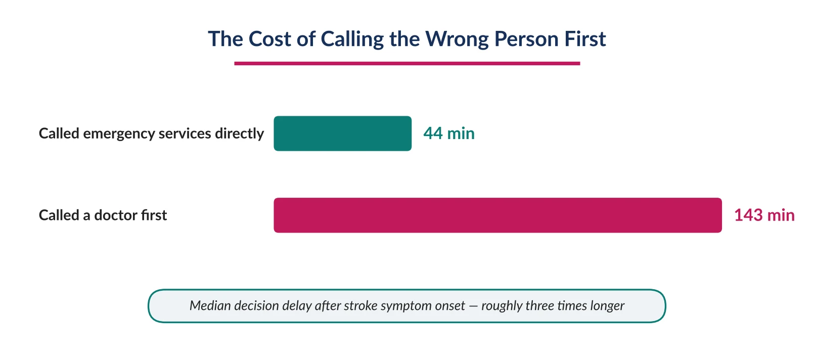
Figure 1. Calling a doctor before an ambulance roughly triples the decision delay in stroke.
Underneath all of this sits one assumption traditional healthcare content shares with the traditional pathway itself: that the affected person, or someone near them, has the awareness, language, and time to work out what's happening and describe it clearly. That reader exists for most healthcare content. They do not reliably exist in the first minutes of a stroke, a cardiac arrest, an anaphylactic reaction, or advancing sepsis — and roughly one in six stroke patients with one-sided weakness cannot even register that anything is wrong at all, a phenomenon called anosognosia.⁷ The condition itself damages the exact neural circuitry a person would otherwise use to notice their own impairment, which means the patient a website is trying to reach is, in a meaningful share of cases, biologically unable to be its user.
The instinctive response — add more patient education, more detail, more thorough content — is precisely backwards. A person mid-event has a shrinking cognitive budget, not a growing appetite for reading. Every additional paragraph between a frightened visitor and a clear next action is a tax on attention the moment can't afford. And the stakes of getting this wrong extend past the individual patient: an organization operating a disease-awareness or locator platform in this space is not a neutral publisher — it is, whether formally acknowledged or not, part of the response chain, and a single bad experience during an emergency does more lasting damage to trust than years of polished content can repair, because the visitor was never evaluating the brand. They were evaluating whether the platform could be trusted with a life.
2. Three Personas in Panic
Critical-moment design needs a finer lens than “the patient.” Three distinct people are likely to touch a health website during an emergency, and a single homepage rarely serves all three.
The alone patient — the hardest case. Possibly unable to recognize their own symptoms (stroke), physically unable to communicate (anaphylaxis, airway closing), too confused to reason clearly (sepsis), or entirely unconscious (cardiac arrest, where the patient can never be a “user” of anything at all).
The bystander on the scene — frightened but functional. Under acute stress they exhibit measurable attentional narrowing: reduced working memory, a pull toward the first plausible action over the best one, and low tolerance for ambiguity or friction.⁸ They are also the person most likely to actually be holding a phone — the highest-leverage design target of the three.
The remote caregiver — calmer, but operating with an information deficit: unable to see the person, needing to make decisions from a distance, sometimes across a time zone.
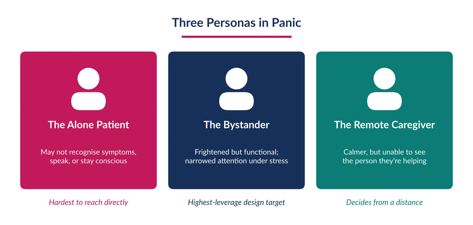
Figure 2. Three people likely to touch a health website during an emergency, each with different constraints.
A behavioral pattern cuts across all three: most people say they'd call emergency services immediately if they suspected a stroke; in practice, only about 12% do, despite roughly 89% saying beforehand that they would.⁹ The gap between stated intention and actual behavior is one of the most important findings in this entire body of research, because it means a website cannot rely on what visitors believe about their own future actions — it has to design for what they demonstrably do under real panic: minimize symptoms, hesitate, call a familiar face before an unfamiliar number, and default to the first plausible option rather than the correct one.
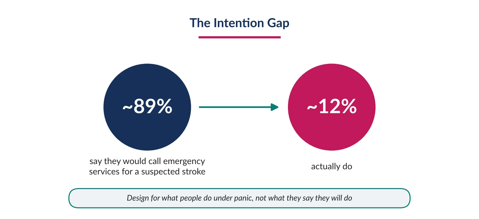
Figure 3. Most people say they would call emergency services for a suspected stroke; few actually do.
Consider how differently each persona experiences the same emergency. In cardiac arrest, the bystander is the only possible actor — the patient loses consciousness almost immediately, so an interface has to be designed entirely around someone who has likely never used it before, under the worst possible conditions, with no time to learn. In a severe allergic reaction, the patient may still be conscious and able to tap a screen, but increasingly unable to speak as their airway swells — which rules out any interface that treats voice as the primary input. Two emergencies, two entirely different design constraints, and neither is served by a single generic “emergency” button that doesn't account for who is actually going to press it.
3. The Core Failure: Websites Built to Inform, Not to Decide
Most healthcare and pharma websites are structured as libraries — a homepage introduces the topic, a navigation menu branches into symptoms and resources, a search bar invites the visitor to look something up. That structure rewards a visitor who has time to browse. It is close to the wrong structure entirely for the minutes after someone's face has started to droop or their throat has started to tighten.
This is also where conventional healthcare website design guidance runs out. Best practice for portals, appointment booking, and clinical software assumes a user completing a planned task. An emergency-facing website serves a user in the middle of an unplanned one — which is why critical-moment websites need to be treated as a distinct category of UX design in healthcare, with their own model.
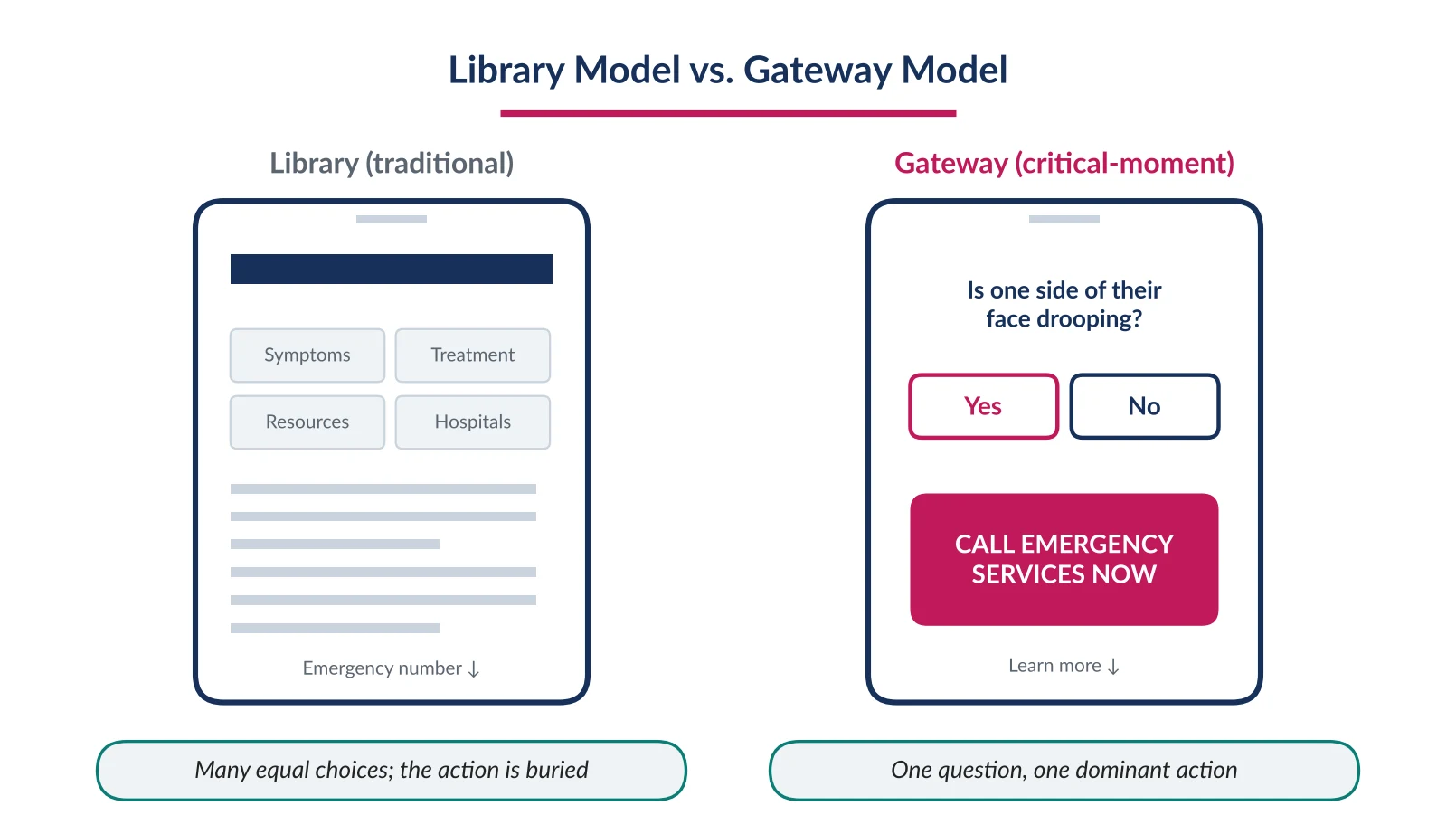
Figure 4. The same moment, two structures: a library that waits to be read and a gateway that asks one question.
The core diagnosis of this paper
Traditional healthcare websites wait for the visitor to arrive with a question and reward the visitor who reads carefully. Critical-moment websites need to anticipate the question before it's fully formed and reward the visitor who acts immediately. Most organizations, across every condition, are still building only the library.
This distinction matters most exactly where traditional design instincts feel safest: adding more detail, more nuance, more options for the visitor to weigh. A library rewards that instinct. A gateway punishes it, because every extra decision point is a decision a frightened visitor has to make correctly, under conditions that make correct decisions measurably harder. The fix isn't a better-written article — it's fewer decisions between the visitor and the one action that matters, which is precisely what the six principles in the next section are built to enforce.
4. Our Approach: Six Principles of Critical-Moment UX Design in Healthcare
Build awareness before the emergency happens
Recognition can't be taught in the sixty seconds after symptoms start — it has to already exist in the visitor's head, or be handed to them instantly. Teach the recognized public checklist for the condition (FAST for stroke, hands-only CPR for cardiac arrest) as the centerpiece of awareness content, not a footnote to it, and repeat the same three-to-five core warning signs consistently everywhere the condition is mentioned. Consistency under calm conditions is what makes recognition possible under panic — a visitor who has seen the same three signs stated the same way five times across a platform is far more likely to recall them correctly in a crisis than one who has read five slightly different versions.
Make content clear and simple by default
Clarity is a comprehension requirement here, not a style preference. Short sentences, everyday words, one idea per sentence; icons paired with brief labels rather than icons or paragraphs alone; a single, consistent visual language for “this is serious, act now” across the whole platform. A warning sign should read like an instruction, not a clinical definition, and every piece of emergency-relevant copy should be tested with real, non-expert readers rather than approved solely by the team that wrote it.
Put actionable elements upfront, not buried in content
The most common failure in existing pharma and healthcare websites is sequencing: the phone number or locator sits at the bottom of an article the visitor never had time to read. Reverse that order categorically — the action comes first, unconditionally, with supporting education underneath for whoever has time to go deeper. Every emergency-relevant page should carry its primary action above the fold, and that action should be visually identical wherever it appears, so a visitor doesn't have to relearn where to look.
Remove confusion so users can act without hesitation
Confusion converts directly into delay, and delay into worse outcomes. One recommended action per screen, plain imperative instructions (“Call emergency services now”) rather than information the visitor has to interpret, and automatic detection — location, likely intent — wherever technically possible, so the visitor is asked to confirm rather than to configure.
Support the full journey — pre, during, and post emergency
A website that exists only for the crisis moment has already lost most of its usefulness, because the crisis moment is when a visitor has the least capacity to learn something new. Section 5 develops this in full, including how it changes the specific problem of finding the right hospital.
Help patients and families care for themselves afterward
The emergency doesn't end when treatment begins. Discharge instructions are followed inconsistently and the caregiver who stayed calm enough to act during the crisis is often left managing recovery alone. A critical-moment platform's obligation extends into recovery: plain-language guidance built from what actually happened, medication and follow-up support, clearly named recurrence warning signs, and explicit self-care guidance for the caregiver too, not only the patient — caregiver stress and burnout following a medical emergency are common and rarely addressed by the same platform that supported the crisis itself.
5. The Emergency Journey: Pre, During, and Post
Traditional healthcare websites are built almost entirely for the middle of this journey — and even then, as information rather than action. Our model treats the emergency as a continuous loop: what's set up in advance shapes how fast a person can act during the event, and what happens during it feeds directly into recovery.
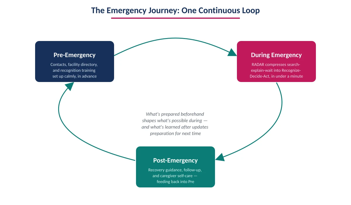
Figure 5. The three phases feed each other in a loop, rather than existing as three separate efforts.
Pre-Emergency
Almost no meaningful preparation happens on a traditional site before symptoms appear. The gateway model treats this as design work in its own right — in effect, helping each household build a simple, personal medical emergency response plan: pre-configured emergency contacts and known conditions set up once, calmly; a capability-aware facility directory built and validated in advance; recognition training delivered as a repeatable, interactive check rather than a one-time campaign; and household-level setup, so a caregiver can configure the profile of someone at higher risk on their behalf.
During Emergency — Finding the Right Hospital
Post-Emergency
Our recommended model treats recovery as a distinct, necessary phase of the same platform: plain-language recovery guidance built from the Relay-stage summary generated during the emergency itself, medication and appointment support, a clearly named list of recurrence warning signs, explicit self-care guidance for the caregiver, and a visible, low-friction path back into the platform so the preparation done beforehand gets updated with what was just learned, rather than reset to zero.
6. Why This Needs a Dedicated Strategy, Not a Feature Backlog Item
Every principle in Section 4 could, in theory, be implemented piecemeal — a clearer homepage here, a locator feature there, a discharge email improved next quarter. In practice, that approach rarely produces a platform a frightened visitor can actually rely on, because the individual improvements keep getting evaluated against the wrong yardstick: engagement, content depth, campaign reach. A dedicated strategy exists to protect a small number of decisions — what counts as success, who has final sign-off on emergency logic, how fast the primary action must be reachable — from being slowly eroded by ordinary marketing and content priorities optimized for entirely different goals.
The patient-safety case
Section 1 quantified the cost of delay across four conditions in terms no organization can ethically treat as background context once measured: lost neurons, falling survival percentages, rising mortality odds, all accumulating in the exact gap a website sits inside. An organization operating a disease-awareness or locator platform in this space is not a neutral publisher; it is, whether formally acknowledged or not, part of the response chain, and that fact doesn't need a business case to justify taking it seriously.
The trust and reputation case
Trust in a critical-moment platform is earned slowly and lost in a single bad experience. A locator that times out, a symptom checker that gives a vague non-answer, a homepage that buries the one action a panicked visitor needed — any of these does more lasting reputational damage than years of polished awareness content can repair, because the visitor was never evaluating the brand; they were evaluating whether the platform could be trusted with a life. That asymmetry is why this category of product can't be governed by the same review cadence, or held to the same success metrics, as a standard content site.
The regulatory and competitive case
Accessibility and AI-governance regulation has moved from aspirational to dated and mandatory across major markets, and health systems and regulators are paying closer attention to whether sponsored health content measurably helps patients rather than simply reaching them. Organizations that treat critical-moment design as a strategic capability — with its own governance, its own metrics, its own standing team — are better positioned for that scrutiny than organizations relying on ad hoc improvements layered onto a conventional content site. That gap between the two postures is likely to become more visible, not less, as this category of digital health product matures.
The strategic argument in one sentence
A critical-moment website strategy exists to make sure that, the next time a product roadmap has to choose between a faster emergency pathway and a more polished awareness campaign, the organization has already decided — in advance, calmly, with the data in Section 1 in view — which one wins.
7. RADAR: A Decision Gateway Framework
A practical, condition-agnostic structure for the first sixty seconds of any critical-moment website visit. In plain terms, RADAR is a healthcare user interface design pattern that moves a visitor through five stages — Recognize, Assess, Decide, Act, Relay — so that a frightened person reaches the one correct action in under a minute, and responders receive what they need on arrival.
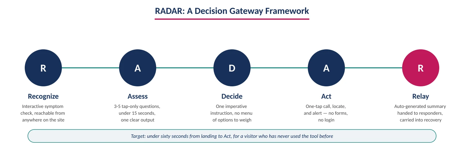
Figure 6. The five RADAR stages, in sequence, with the design commitment each one enforces.
The same five-stage skeleton holds across conditions, while what happens inside each stage adapts to clinical reality — for cardiac arrest, for instance, Assess collapses to a single confirmation and Recognize is designed entirely for the bystander, since the patient loses consciousness and can never be a user of the tool at all.
Walk through what this looks like in practice for a bystander who has just noticed something is wrong. They land on the page — from a search result, not necessarily the homepage — and within five seconds see one large action rather than a menu. Recognize asks one plain question with a visual reference, answered with a tap. Assess adds two more, each just as fast, and ends with a single sentence: any one of these signs is enough, don't wait for more. Decide states the instruction outright. Act dials emergency services and shares location in the same motion. Relay quietly builds a timestamped summary in the background the whole time, ready the moment it's needed. None of this requires the bystander to have read anything in advance — though it works far better if the Recognize-stage signs are already familiar from the Pre-Emergency awareness-building described in Section 4.
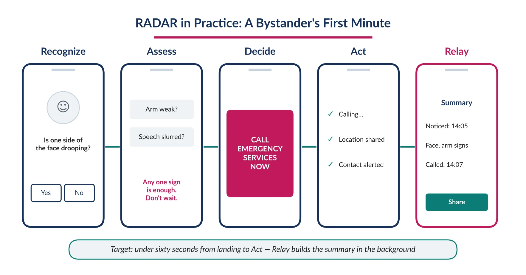
Figure 7. What each RADAR stage looks like on a bystander's phone, from landing to handoff.
8. Healthcare Website Accessibility: Designing for the Symptoms You're Responding To
This is one of the most distinctive constraints of emergency interface design, and it's easy to miss if healthcare website accessibility is treated as a generic checklist rather than a condition-specific problem: the interface has to remain usable by someone actively experiencing the symptoms it exists to respond to.
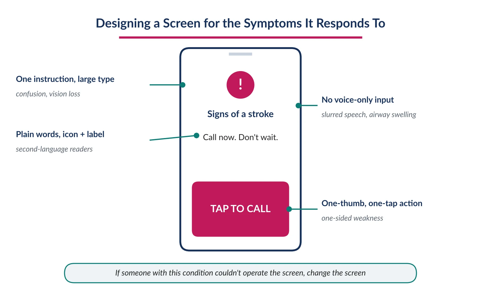
Figure 8. Each element of an emergency screen answers a specific impairment the condition may cause.
A stroke patient may have a numb hand, slurred speech, and partial vision loss all at once — which rules out two-handed gestures, voice-only input, and small text as the default path. A confused sepsis patient, or a caregiver managing severe hypoglycemia, needs radical simplicity above all else. Standard accessibility conformance is necessary but not sufficient here: a screen reader alternative solves a permanent visual impairment, but it doesn't solve a sudden, temporary visual field cut experienced by someone who has never used a screen reader and won't learn to in the next ninety seconds.
A principle worth stating in every brief
Could this specific screen still be operated by someone experiencing the exact impairment this condition causes — a numb hand, a closing airway, a confused mind, or total unconsciousness? If the honest answer is no, the screen needs to change, not the user.
9. When the Patient Is Alone: Passive and Semi-Passive Patterns
Everything discussed so far assumes a visitor deliberately opens a website or app. The hardest, and most clinically important, scenario in this paper is the one where that assumption fails — the person is alone, and either doesn't realize anything is wrong, cannot communicate it, or has lost consciousness altogether, as in cardiac arrest. No website, however well designed, can be opened by someone who doesn't know to open it, or who is unconscious. This section looks at what pharma and healthcare organizations can realistically build to reduce, not eliminate, that gap, while being honest about the limits involved.
Pre-configured “check on me” relationships
The lowest-risk, highest-value pattern available today isn't exotic detection technology — it's a simple, opt-in relationship set up in advance, during the Pre-Emergency phase: a person designates one or more emergency contacts through a health platform, and a single, very large, always-reachable button lets them — or, critically, lets a nearby stranger using their unlocked phone — alert those contacts with location in one tap. This doesn't require the patient to self-diagnose; it only requires someone, patient or bystander, to recognize that one tap needs to happen.
Voice and ambient signals as a nudge, not a diagnosis
Voice assistants and smart-home devices increasingly sit in the same room as an at-risk person and are already listening for wake words. There's a legitimate, if early-stage, opportunity to treat a sudden, marked change in speech clarity — detected passively during an otherwise ordinary voice interaction — as a trigger for a gentle, low-stakes check-in prompt: “You sound different than usual — are you okay?” with a one-word response path to escalate. This has to be designed conservatively: it's a nudge toward the RADAR Recognize stage, never a diagnosis, and it must fail safely toward asking rather than assuming.
Wearables and motion anomalies
Consumer wearables already detect hard falls and irregular heart rhythms in some products — directly relevant given that roughly seven in ten out-of-hospital cardiac arrests happen at home, precisely the setting where no bystander may be present at all. The same category of passive signal can plausibly extend toward stroke-adjacent and other use cases in partnership with device makers. The design responsibility here is less about building the sensor and more about designing what happens the moment such a signal fires: a fast, unambiguous escalation path, ideally converging on the same Assess and Act stages already built for the conscious bystander.
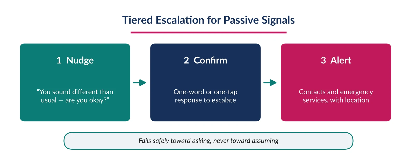
Figure 9. Passive signals escalate in tiers, so a false alarm stops at a question rather than an emergency call.
Being honest about the limits
False positives are inevitable at scale, and a system that alerts emergency services too often will be deprioritized or disabled — tiered escalation (nudge, then confirm, then alert) is safer than a single hair-trigger action.
All passive detection has to be explicitly opt-in, clearly explained, and easy to turn off — trust, once lost over a false alarm or a privacy concern, is very hard to rebuild in exactly the population most likely to need the feature.
None of this replaces the core public health message: any suspected emergency should trigger an emergency call immediately. Passive detection augments the moments when no one is present to make that call — it is not a substitute for the human decision to call.
10. The Bystander and Caregiver Experience: Designing the Second Screen
If the alone-patient scenario is the hardest to reach directly, the bystander is the highest-leverage persona to design for deliberately — present, functional, and the person most likely to actually be holding a phone and searching in the critical minutes, across every condition in this paper.
An interactive recognition test as a homepage feature
Public campaigns have spent years successfully teaching simple recognition tools — FAST for stroke, hands-only CPR steps for cardiac arrest, “epinephrine first, ask questions later” for anaphylaxis — through posters and print. Most disease-awareness websites still relegate this to a static page several clicks deep. Bringing an interactive version of the relevant test to the homepage, reachable in one tap from anywhere, converts decades of public health messaging investment into an actual point of action rather than a page the bystander has to already know to look for.
Visual comparison and plain language, without losing precision
Under stress, a bystander is often unsure whether what they're seeing — a slightly uneven smile, hives that look mild, breathing that sounds a little off — is significant. Side-by-side visual or plain-language reference points resolve that uncertainty faster than a written medical description. A bystander's native language, reading level, and familiarity with medical terminology also can't be assumed on multi-market platforms; icon-first design paired with short, plain-language labels performs best across that range, and every piece of Assess- and Decide-stage copy should be tested at a level well below what a typical marketing or medical-education page would use.
Routing to the right facility, and preparing to relay
“Nearest hospital” and “nearest hospital equipped for this specific emergency” are frequently different places, and routing a bystander to the wrong one can itself introduce delay through a secondary transfer. Where data partnerships allow, a locator feature should distinguish appropriately equipped centers from general facilities. And a bystander who can tell arriving paramedics or ED staff exactly when symptoms started and what they observed measurably helps clinicians move faster through the initial assessment — a simple, guided prompt captured at the Assess stage and carried through to Relay turns a frightened bystander's fragmented memory into a clear, time-stamped handoff.
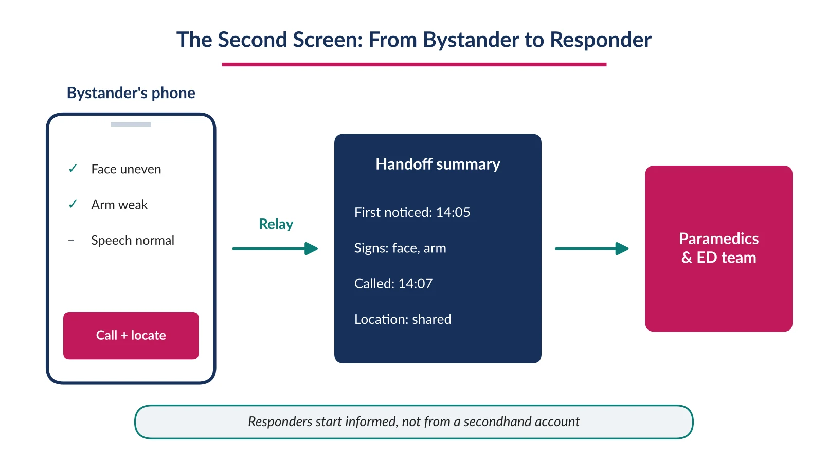
Figure 10. Signs captured during Assess become a time-stamped summary responders can act on.
11. Case Study: Applying RADAR to a Stroke Hospital Locator
A note on confidentiality and scope
Described directionally, drawing on real design work on a patient-facing stroke platform localized for Southeast Asian markets. Sponsor-specific details have been generalized. This is presented as a design case study, not an outcomes study — no usage or clinical outcome metrics from the live platform are available to report here. What follows is the reasoning behind the redesign itself: a project undertaken specifically to rebuild the experience around criticality, the different personas likely to use it, and the situations they'd be in when they did.
The brief was singular: get a person experiencing stroke symptoms, or someone with them, to the nearest stroke-ready hospital as fast as possible, through one primary action — “Locate Me” — placed above every other consideration. Navigation was limited to four pillars (What is Stroke, Prevention, Emergency, Post-Stroke Care) so a visitor arriving in crisis was never more than one tap from the emergency pillar, regardless of which page a search engine had sent them to.
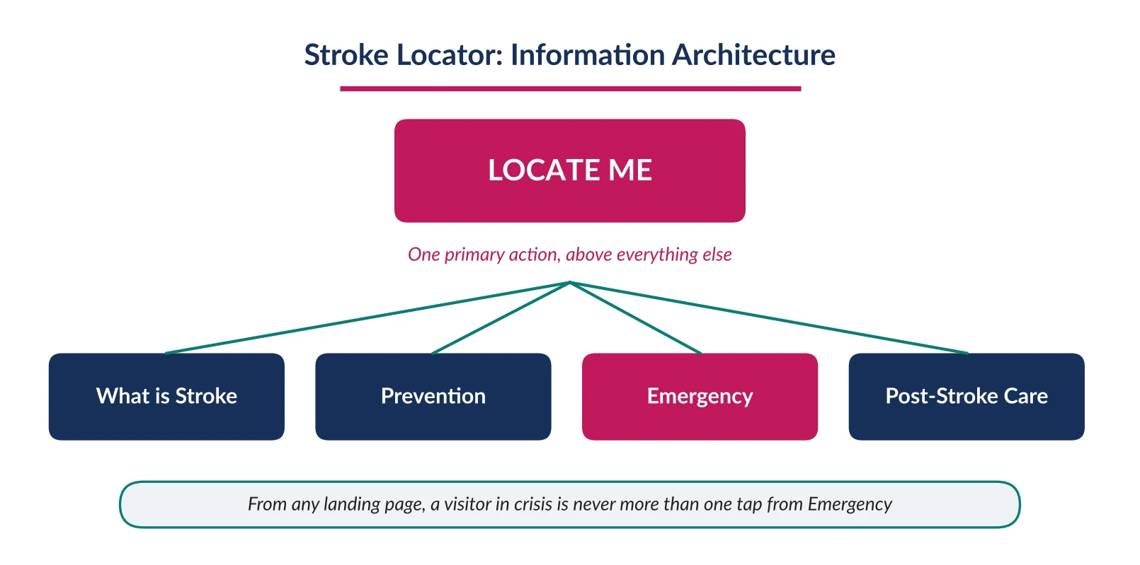
Figure 11. The locator's four-pillar structure, with one primary action above every page.
The redesign deliberately worked through the same lens this paper argues for: criticality first, meaning the emergency action was treated as the page's entire reason for existing, not one feature among several; multiple personas, meaning the patient, the bystander, and the calmer researcher-mode visitor were each given a distinct, fast path rather than one shared homepage; and situational awareness, meaning the design accounted for a visitor who might be on a low-end phone, in poor lighting, or reading in a second language, rather than assuming ideal conditions. Hospital listings needed monthly updates as facilities changed stroke-ready status, so the directory was built as a modular component in-market teams could refresh without a development cycle. Content was structured in layers, too: a simple, FAST-based recognition tool for the public sat above more clinically detailed material — the NIH Stroke Scale, interhospital transfer protocols — for professional or more informed users, so no visitor was forced through more depth than they needed in the moment.
Mobile-first is not a screen-size decision in an emergency product — it's an assumption about the user's physical and emotional state.
Designing explicitly for criticality, persona, and situation — rather than for a single generic visitor — changed concrete decisions: navigation depth, what sat above the fold, and what was deferred to a secondary page.
Designing a component for its first content update, not just its launch, is what determines whether it stays maintainable.
This case study reflects hands-on design work delivered by Indegene's experience design team — the same framework-to-delivery path described throughout this paper.
Applying RADAR to your own platform
If your organization runs, or is planning, a patient-facing website or portal in an emergency-focused therapeutic area, the same exercise applies: map your primary emergency flow against the five RADAR stages and time how long it takes a first-time visitor to reach the one action that matters. Indegene can help run that mapping with your team.
12. Beyond the Emergency: What Every Patient Website Should Get Right
Everything so far has focused on the acute, time-critical end of the spectrum. But most of a patient website's traffic, even on a platform built around an emergency use case, isn't happening mid-crisis — it's someone researching a diagnosis at midnight, a caregiver comparing treatment options, a patient checking whether a symptom is worth worrying about. These moments deserve the same seriousness as the critical ones, and a handful of considerations get missed even on otherwise well-designed healthcare sites.
Every page is a potential front door, not just the homepage
Most patients don't arrive at a health website through its homepage — they arrive through a search engine, on the exact page that answers the specific symptom or question they typed. That means the primary action, the trust signals, and the plain-language tone this paper argues for can't live only on the homepage; they need to be present on whichever page a search engine happens to land someone on, because for that visitor, this page is the whole website.
Trust is built through visible authorship, not assumed from the domain
A patient reading about their condition at midnight has no way to judge a page's medical accuracy except through the signals it gives them. A visible “reviewed by Dr. [Name], [credential], last updated [date]” line does more for credibility than any amount of polished design, and its absence is now one of the more noticeable gaps on pharma and healthcare content — especially as both patients and search engines increasingly scrutinize who actually stands behind medical claims.
Content needs a maintenance cadence, not just a launch date
Medical guidance changes — dosing recommendations, treatment protocols, even which symptoms warrant urgent care. A page that was accurate at launch and hasn't been reviewed since is a liability, not an asset, and patients have no way to tell the difference between current guidance and something three years stale unless the page tells them. Content ownership should include a standing review cycle, not just an initial approval.
Health searches are inherently sensitive — design for that by default
Someone researching a new diagnosis, a fertility question, or a mental health concern is often doing so privately, sometimes fearfully, and frequently without wanting anyone else to know they looked. Aggressive tracking, intrusive cookie prompts, or personalization that makes a visitor feel watched are a worse experience here than almost anywhere else on the web. Privacy-respecting defaults aren't just a compliance checkbox on a patient website — they're part of making someone feel safe enough to keep reading.
Tone: honest without alarming, warm without being vague
Patient content has a narrower band to write in than most content does. Too clinical, and a frightened reader feels unseen. Too soft, and important information gets lost in reassurance. Too alarming, and a reader disengages entirely rather than acting on what they've read. The content that works best names what's true plainly, acknowledges that it may be difficult to read, and never substitutes vague comfort for a clear next step.
The searcher often isn't the patient
A meaningful share of health searches are done by someone other than the patient — a parent researching a child's symptoms, an adult child looking into a parent's diagnosis, a partner trying to understand what to expect. Content written only in the second person (“you may be experiencing”) quietly excludes this audience. Writing that acknowledges both “if this is you” and “if this is someone you care for” serves a real, often-overlooked share of visitors without adding real complexity to the page.
A short list worth checking against any patient page
Does this specific page — not just the homepage — make the primary action and trust signals visible? Is it clear who wrote or reviewed this, and when? Would a visitor know if this information were out of date? Does the page behave respectfully toward someone searching privately? Does the tone stay honest without tipping into alarm? And does the writing account for a caregiver reading on someone else's behalf, not only the patient themselves?
13. The Solution in Practice
Put together, the six principles, the Pre/During/Post journey, and the RADAR model aren't separate ideas — they're one system, applied at three different altitudes. The six principles set the intent: what a critical-moment platform is trying to do for the people who land on it. The Pre/During/Post journey sets the timeline: preparation, action, and recovery, treated as one continuous loop instead of three disconnected efforts. RADAR sets the mechanism: the specific five-stage sequence that turns that intent into something a frightened visitor actually experiences in under a minute.
Making that system real doesn't require an all-at-once rebuild. It requires three commitments held consistently: the Assess-stage logic behind any “call for help now” instruction should be authored and signed off by someone with real clinical authority, not assembled by a content team alone; success should be measured by time-to-first-action rather than by traffic or time-on-page, since a fast exit is often the sign the system worked; and the effort should start with one flagship condition built end-to-end, rather than many conditions built shallowly at once. The first two commitments work together: clinical sign-off is what lets a platform optimize for speed without trading away accuracy or safety. Everything else — team structure, tooling, rollout pace — is a detail that follows from getting those three commitments right first.
14. Summary
Medical emergencies share a cruel pattern: the condition itself — stroke, cardiac arrest, anaphylaxis, sepsis — often damages the very ability to recognize, explain, or act on what's happening, at the exact moment those abilities matter most. Traditional healthcare and pharma websites are built for a reader who doesn't exist in that moment: calm, literate, with time to browse. The result is a well-documented pattern of delay — minimized symptoms, the wrong first phone call, a diagnosis pieced together secondhand — that costs measurable time against conditions where minutes determine outcome.
This paper's answer is to treat critical-moment design as its own discipline within UX design in healthcare, not a variation on ordinary content strategy. Six principles — build awareness early, keep content radically clear, put action before explanation, remove confusion, support the whole journey, and help people recover afterward — set the standard. The Pre/During/Post model extends that standard across the full arc of an emergency, not just the crisis itself. RADAR (Recognize, Assess, Decide, Act, Relay) turns it into a concrete five-stage flow. And the stroke locator case study shows the model isn't theoretical: a single, unmissable action, a content architecture layered for both public and clinical audiences, and infrastructure built to stay current — design decisions shaped from the start around the people who would need the platform most.
15. Key Learnings & The Way Forward
A website is part of the emergency response chain whether it's designed that way or not — treating it as a neutral content property is itself a design choice, and often the wrong one.
Confusion is not a minor usability flaw in this context — it is measurable delay, and delay has a documented cost in outcomes, across every condition this paper examined.
The instinct to add more information in the name of thoroughness is almost always the wrong instinct for a visitor in crisis; fewer decisions, not more content, is what actually helps.
Preparation done calmly, before an emergency, is what makes speed possible during one — the During phase only works as well as the Pre phase that fed it.
None of this requires a full rebuild to begin. It requires picking one flagship flow, timing it honestly against a five-second standard, and building outward from there.
The way forward is not a bigger content library or a more advanced AI feature bolted onto an existing site. It's a smaller, sharper commitment: pick one emergency your organization is positioned to help with, map it against the RADAR model, and measure it by how fast it moves a frightened person to the one action that matters. Organizations that make that shift will not just publish more useful content — they will, in a real and measurable way, become part of how their patients survive their worst moments. That is the standard this paper argues every critical-moment healthcare platform should be held to, starting now.
Start with a critical-moment review
Planning or revamping a patient-facing website or portal in an emergency-focused therapeutic area? Indegene offers a critical-moment review of an existing patient site: we map your primary emergency journey against RADAR, time the path to first action, check it against symptom-aware accessibility, and return a prioritized set of fixes. Contact Indegene to request one.
Contact IndegeneReferences
1. Prehospital Delay in Acute Stroke and TIA (PubMed) — decision delay accounts for 55% of total prehospital delay. https://pubmed.ncbi.nlm.nih.gov/22886891/
2. Family Physician Decisions Following Stroke Symptom Onset and Delay Times to Ambulance Call (PMC). https://www.ncbi.nlm.nih.gov/pmc/articles/PMC3170189/
3. Diagnostic Errors in the Emergency Department: A Systematic Review (AHRQ). https://effectivehealthcare.ahrq.gov/products/diagnostic-errors-emergency-updated/research
4. American Red Cross — CPR Facts & Statistics. https://www.redcross.org/take-a-class/resources/articles/cpr-facts-and-statistics
5. Predictors of Fatal Anaphylaxis: A Systematic Review (Karger). https://doi.org/10.1159/000550989
6. Effect of Delayed Antibiotic Use on Mortality Outcomes in Sepsis or Septic Shock (ScienceDirect). https://www.sciencedirect.com/science/article/abs/pii/S1567576924001346
7. StatPearls / National Library of Medicine — Anosognosia. https://www.ncbi.nlm.nih.gov/books/NBK513361/
8. Journal of Emergency Nursing — A Cognitive Task Analysis for Developing a Clinical Decision Support System for Emergency Triage. https://www.jenonline.org/article/S0099-1767(25)00174-6/fulltext
9. Understanding Reasons for Delay in Seeking Acute Stroke Care in an Underserved Urban Population (PMC). https://pmc.ncbi.nlm.nih.gov/articles/PMC3130551/